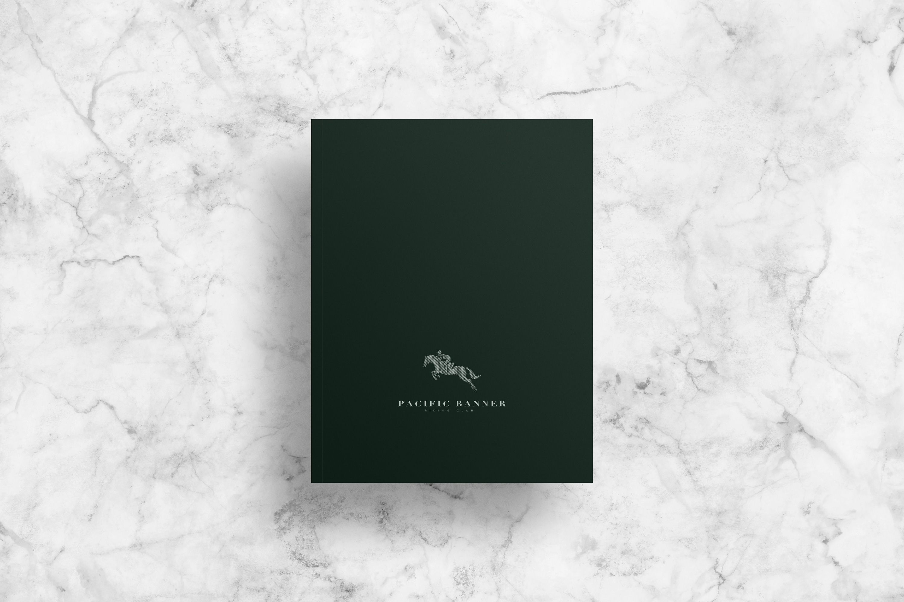
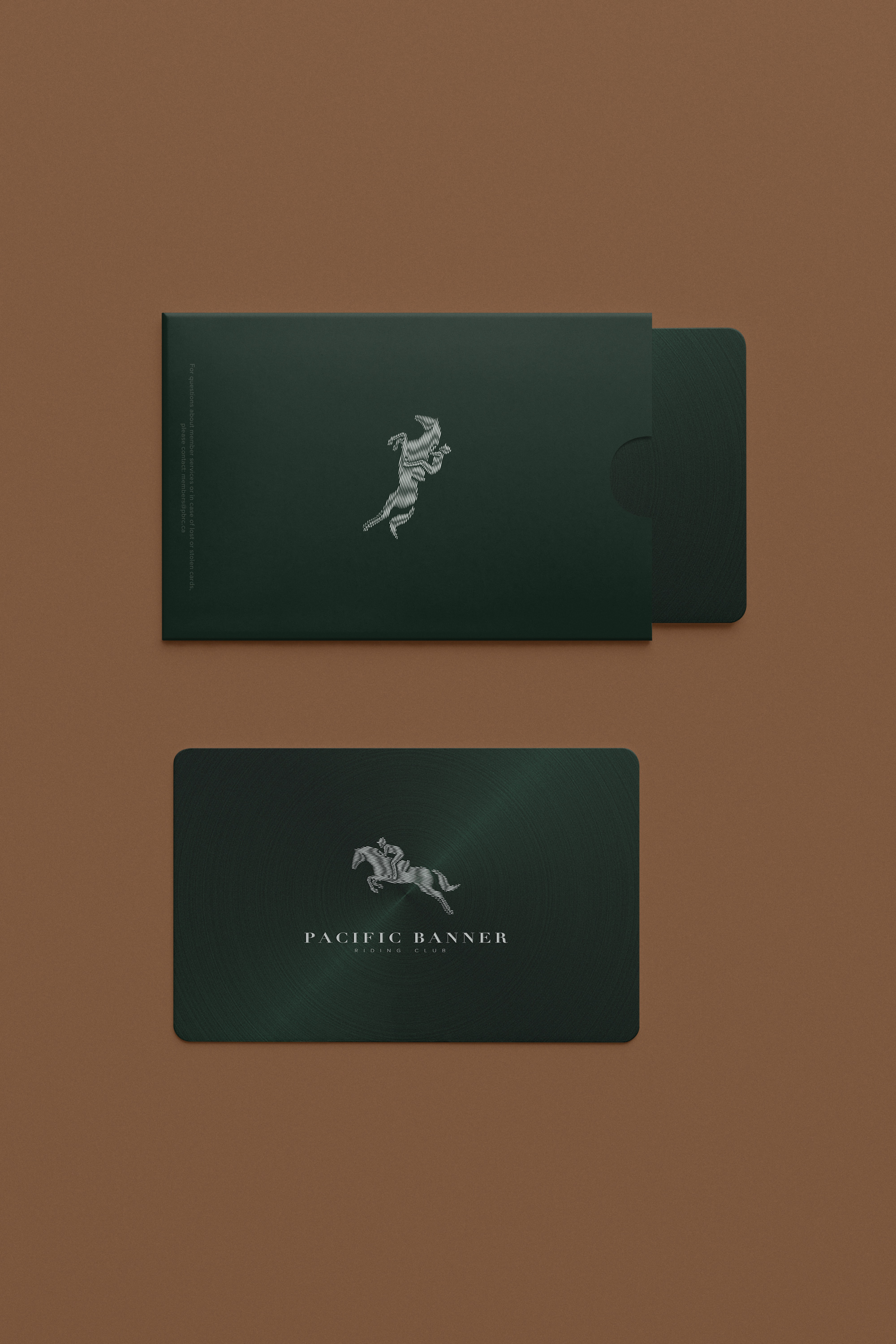
Pacific Banner Riding Club
Born to run.
Year
2018
Discipline
Exclusive Services
Services
Brand Identity
Name Generation
Art/Creative Direction
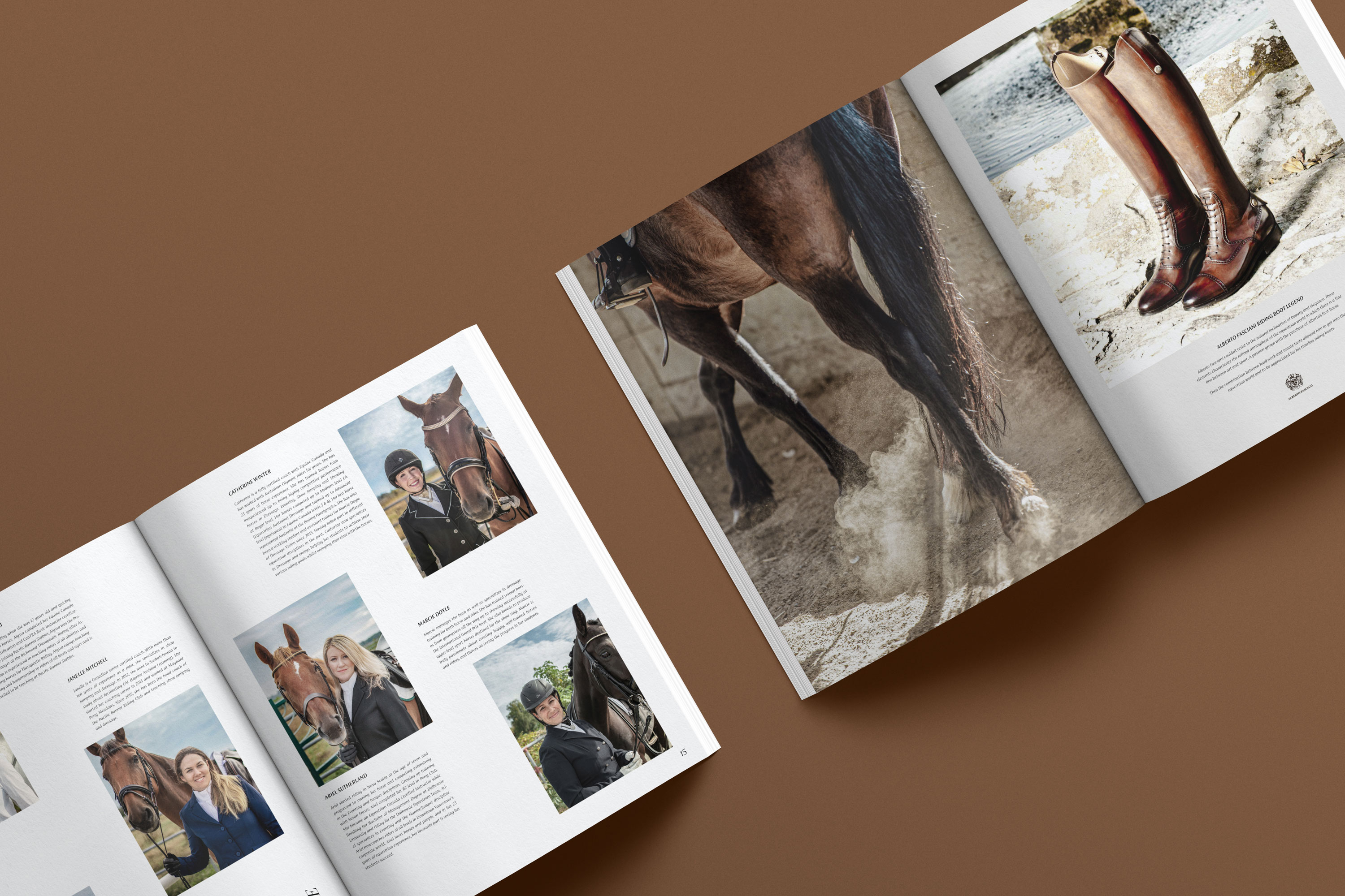
Commercial Photography
Editorial
Packaging
Environmental Design
Signage & Wayfinding
Integrated Campaigns
Production Management
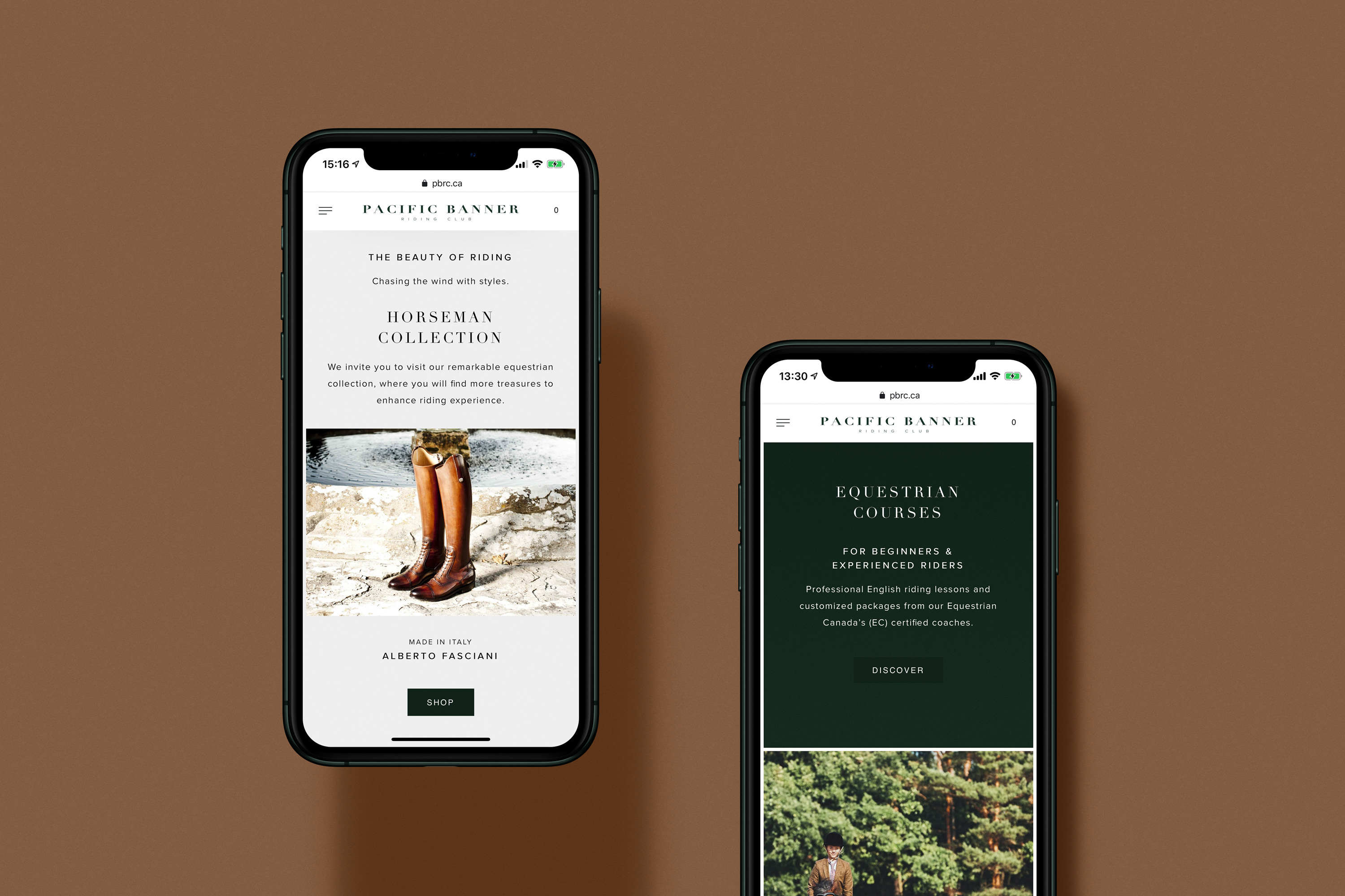
UI/UX
Website Design & Development
Collaborators
Photography by Shawn Image / Ho Lun Cheung
Website by Edward Yan / Elvis Song
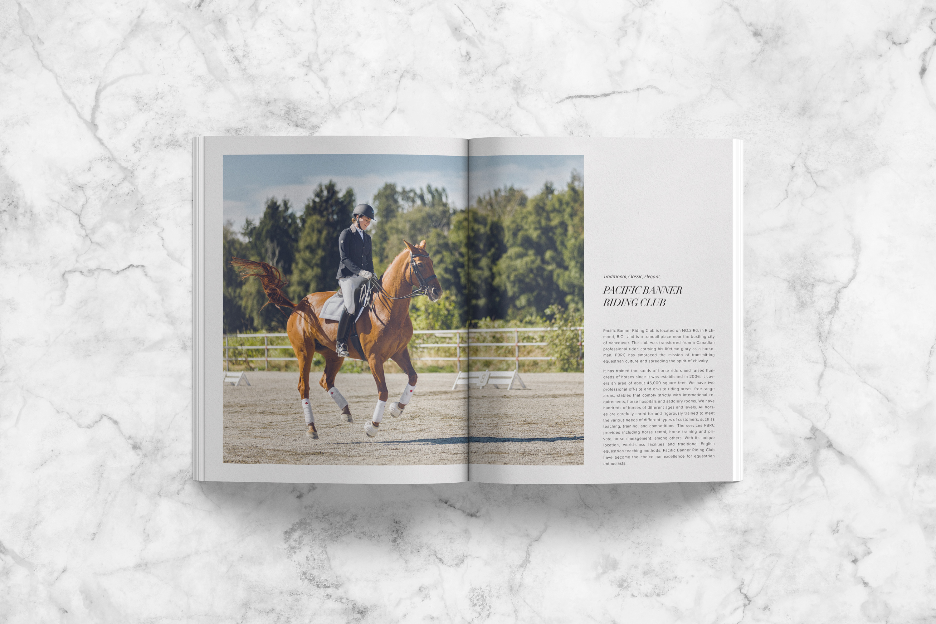
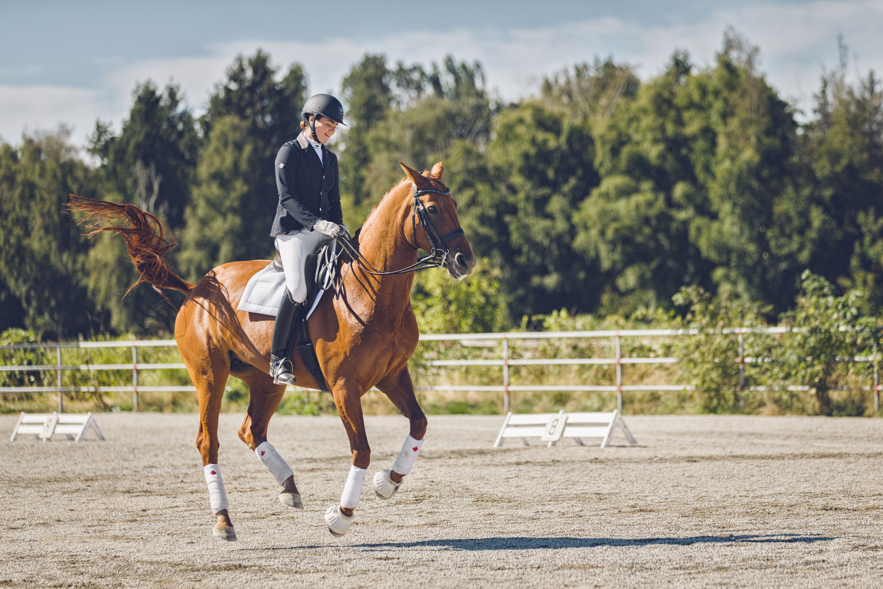
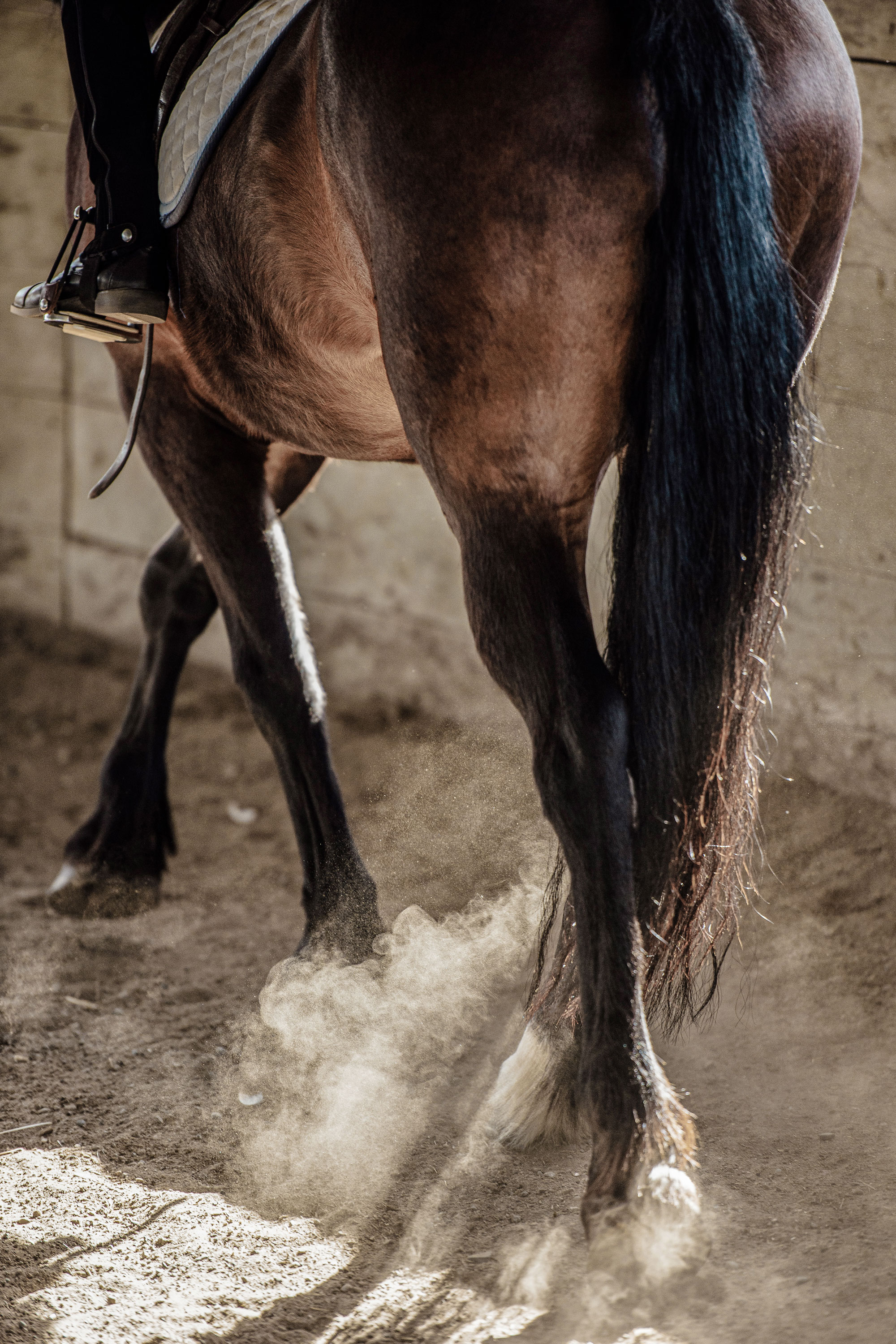
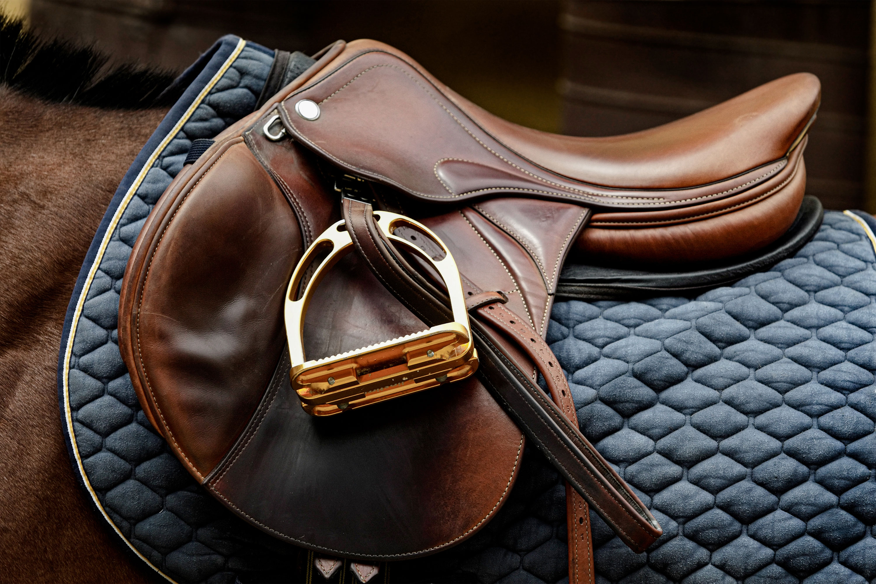
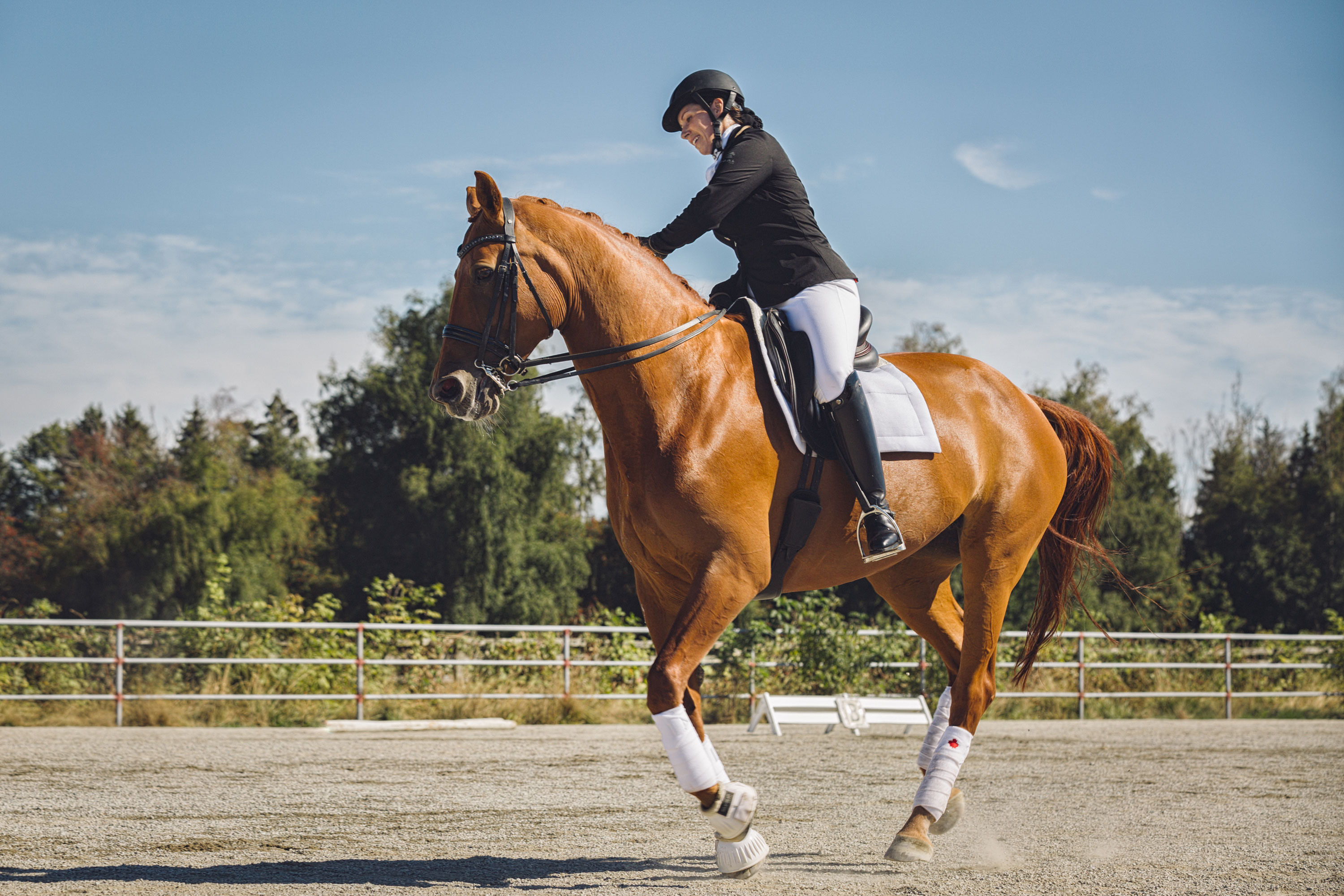
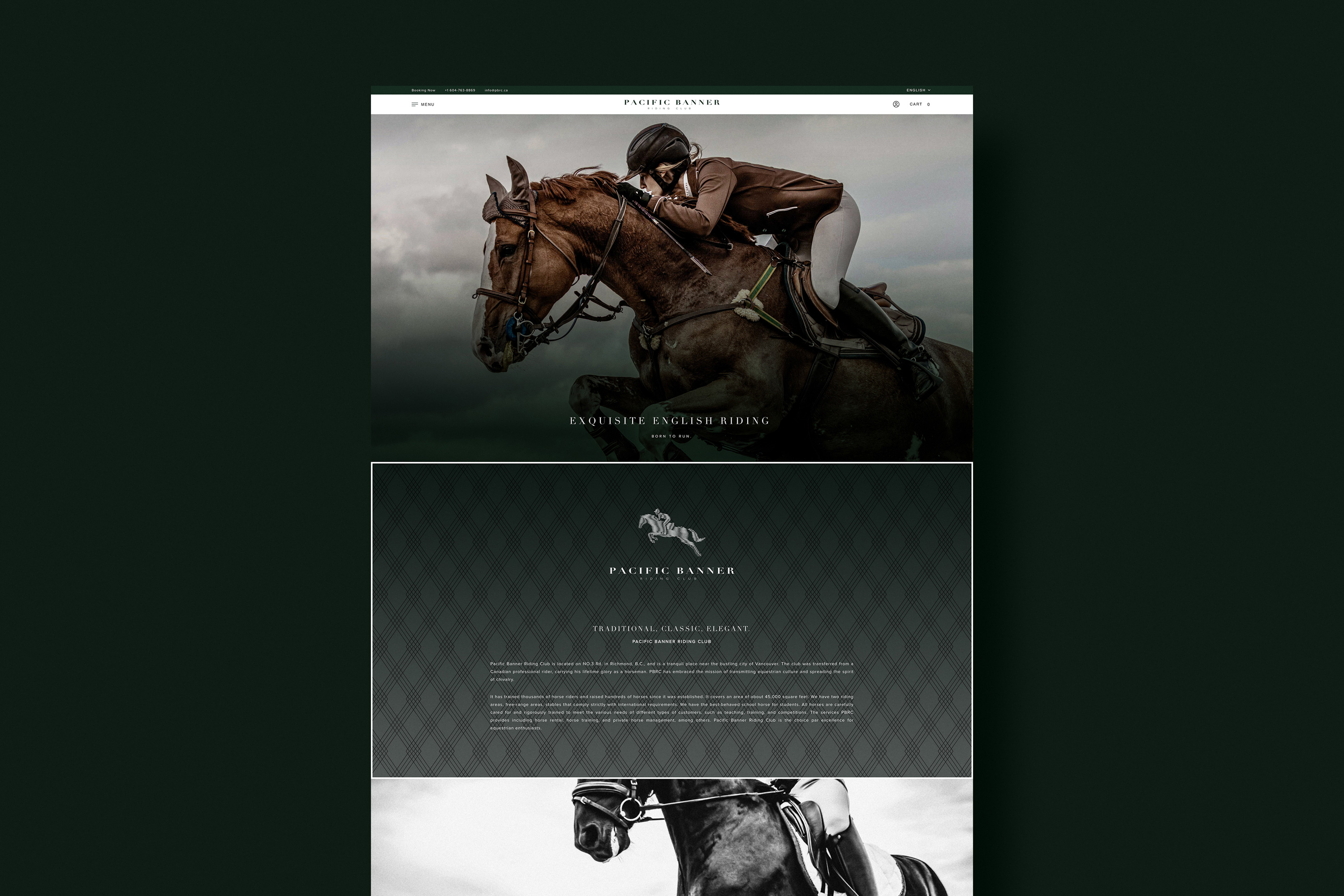
Situated in a tranquil place next to the city, Pacific Banner Riding Club brings a modern take on an English riding, which differs from the western ride prevalent in North America. The company intends to transmit the equestrian culture and spread the spirit of chivalry. In the process, PBRC has requested us with the overall branding, from graphic designs to the website.


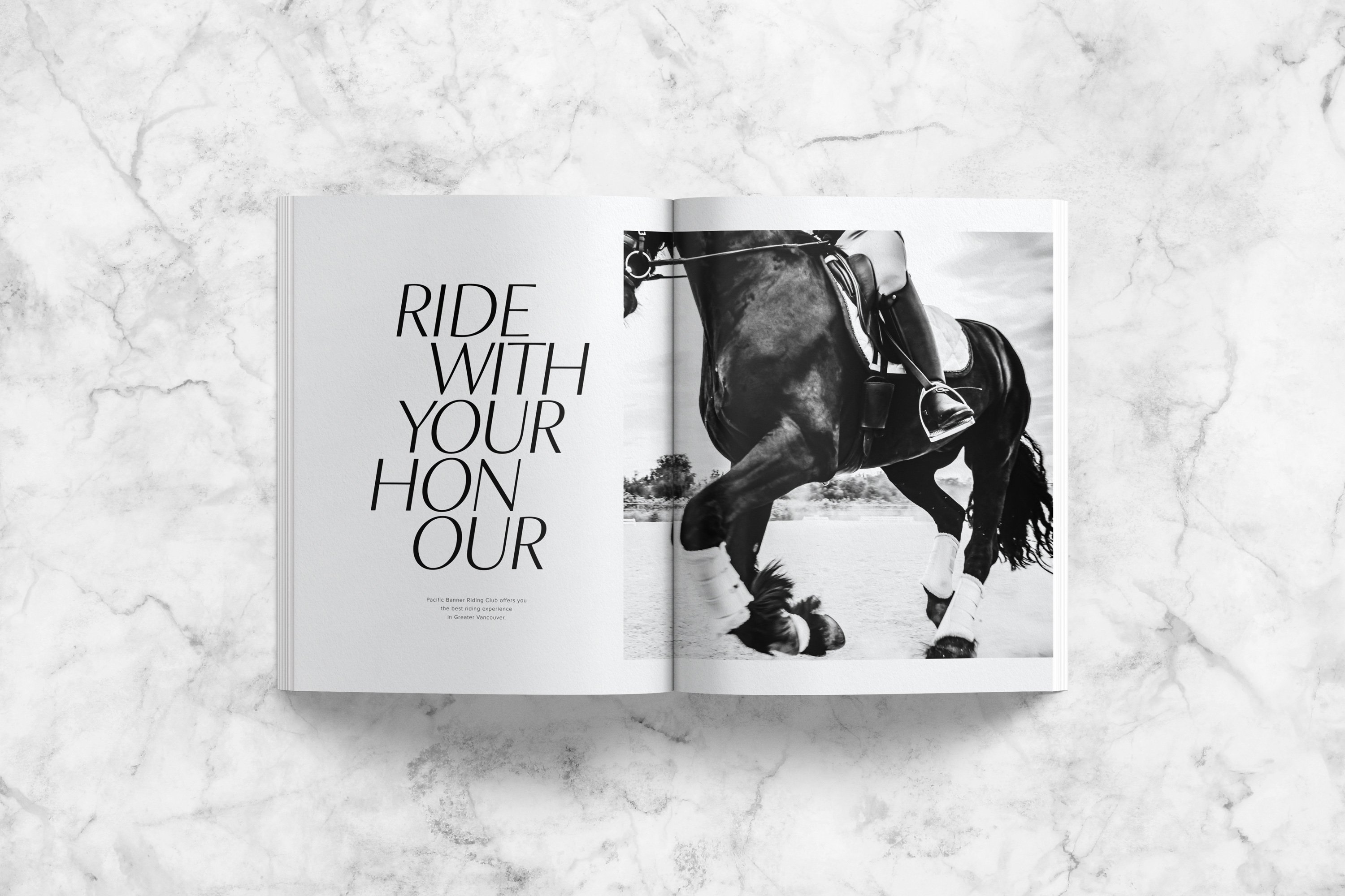
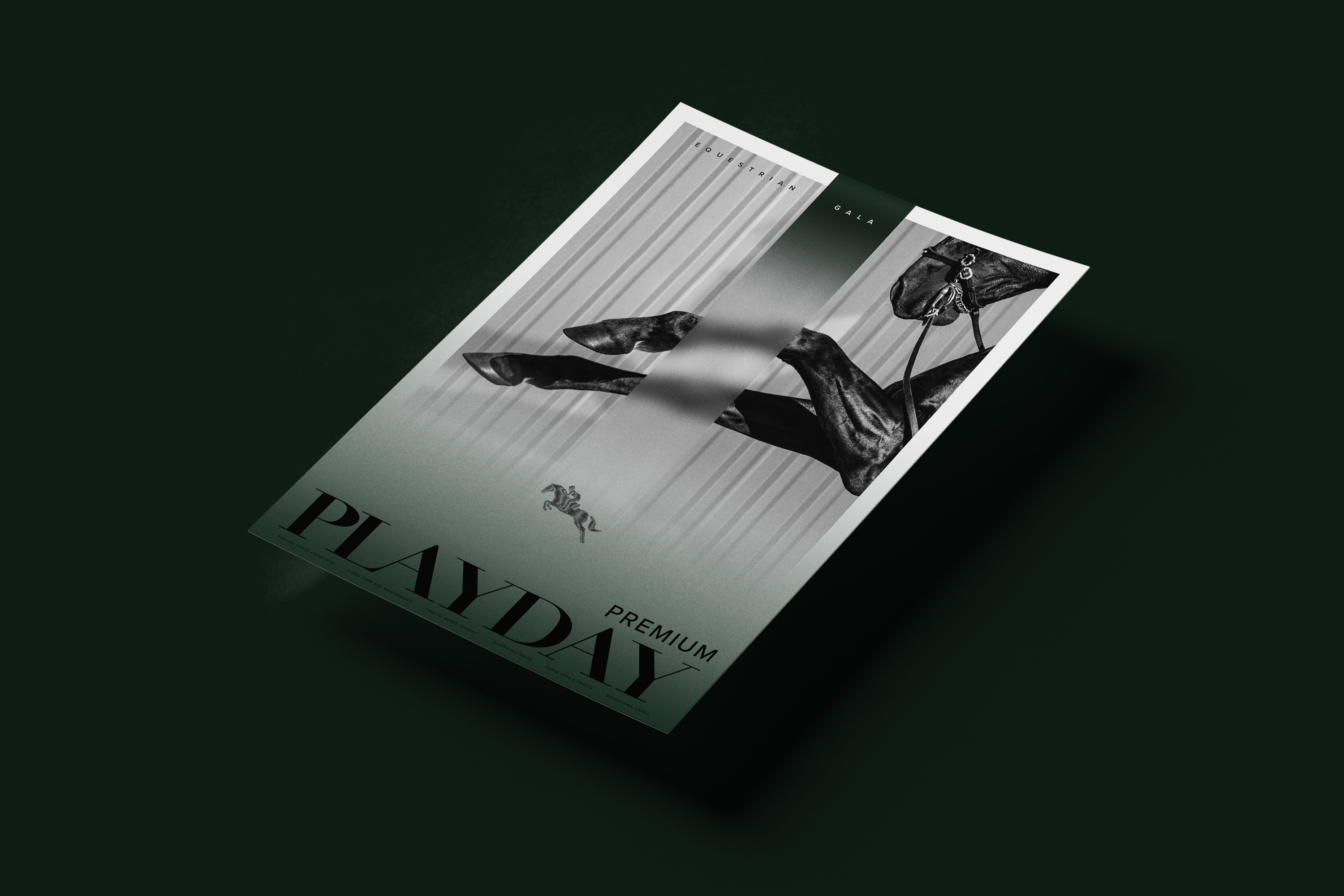
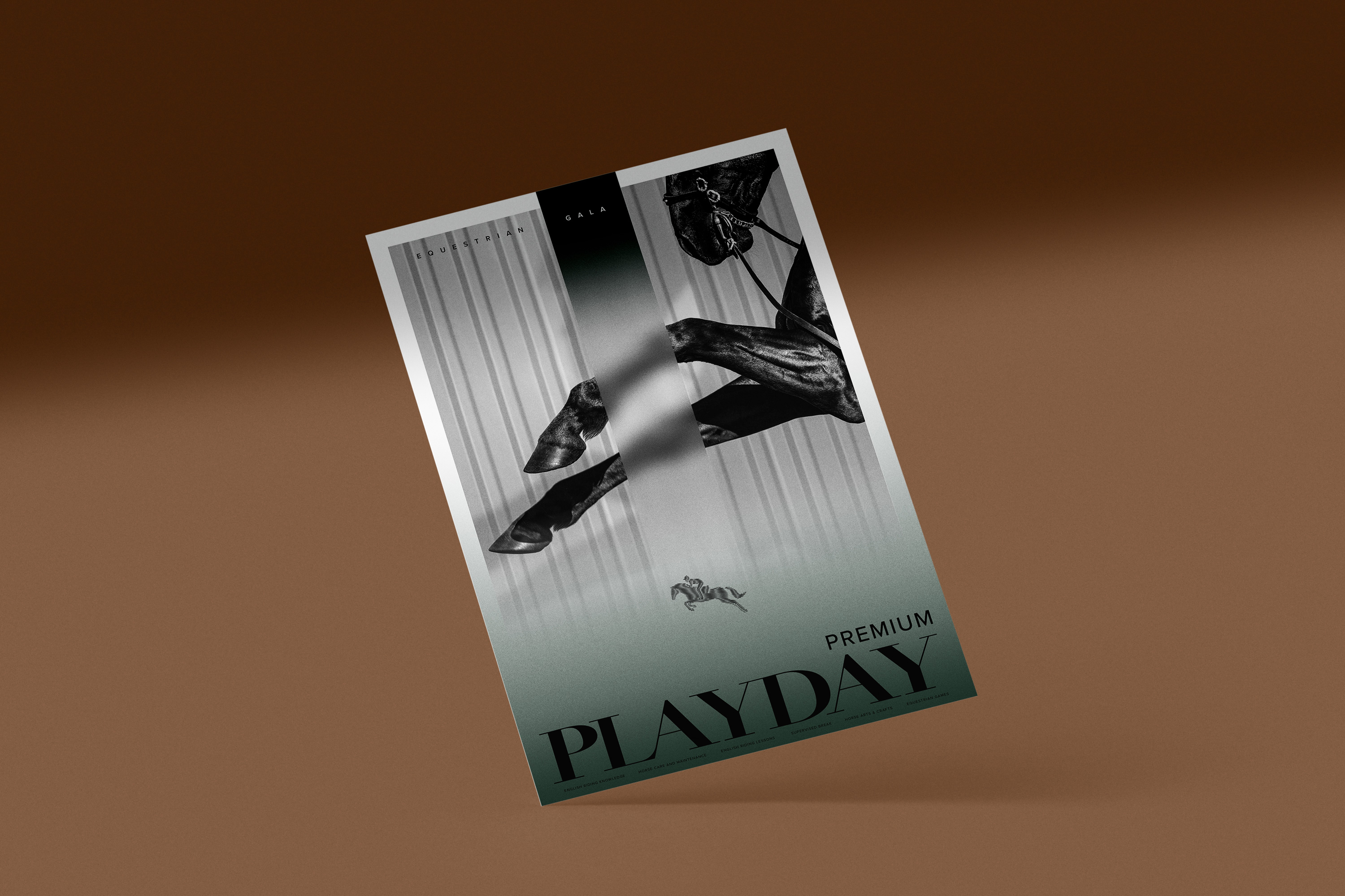
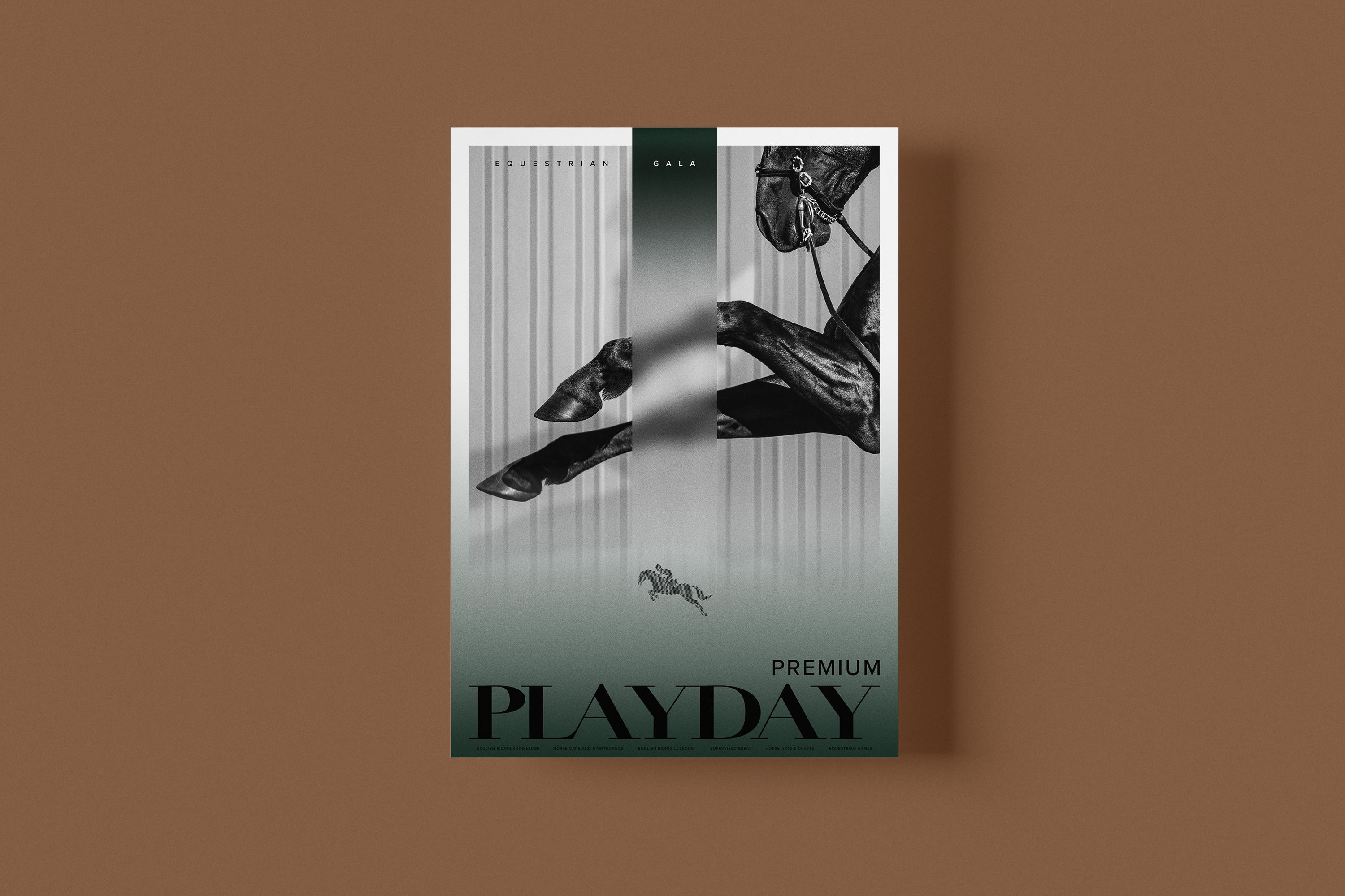
The concept itself was based on the energetic yet formal and long-established form of horse riding seen in the various events at the Olympics. PBRC takes its design cues from the origin of English riding, Europe. The brand colour inspired by the nature that surrounds Vancouver, Brunswick Green, comes from Germany and is found in British Rail locomotives to radiate an upscale aura.
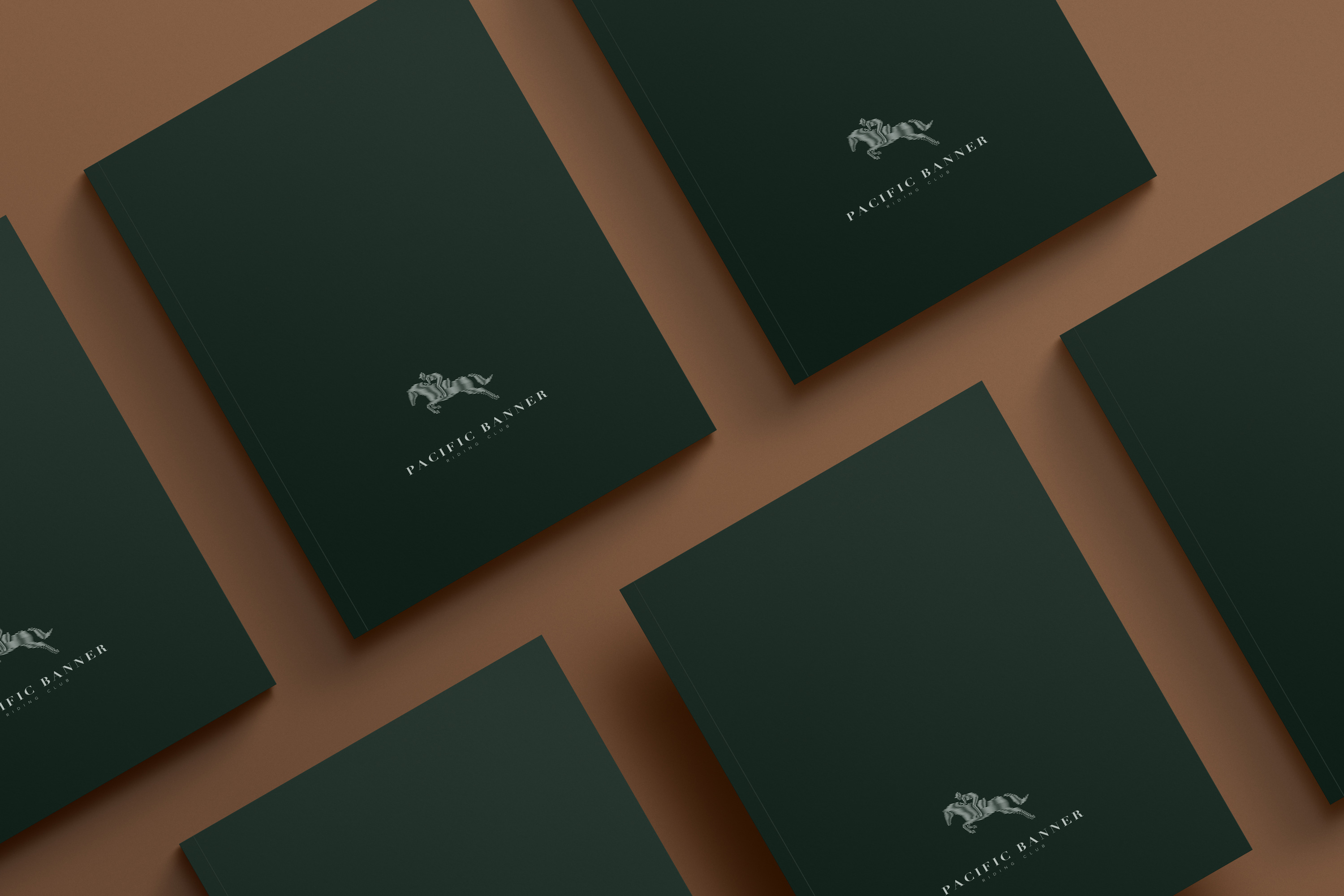
Playing with the contrasting line widths, the logo depicts a dynamic illusion of a rider on the horse. It gives an impression of strength and speed that a rider would experience at the moment. The logotype has been developed as a custom typeface influenced by English heritage brands. The tailored typography and carefully selected photographs give a disposition associated with the equestrian discipline. A subtly hidden cross pattern throughout the designs inspired by classic European artworks adds character and narrative, which enhances the visual experience.