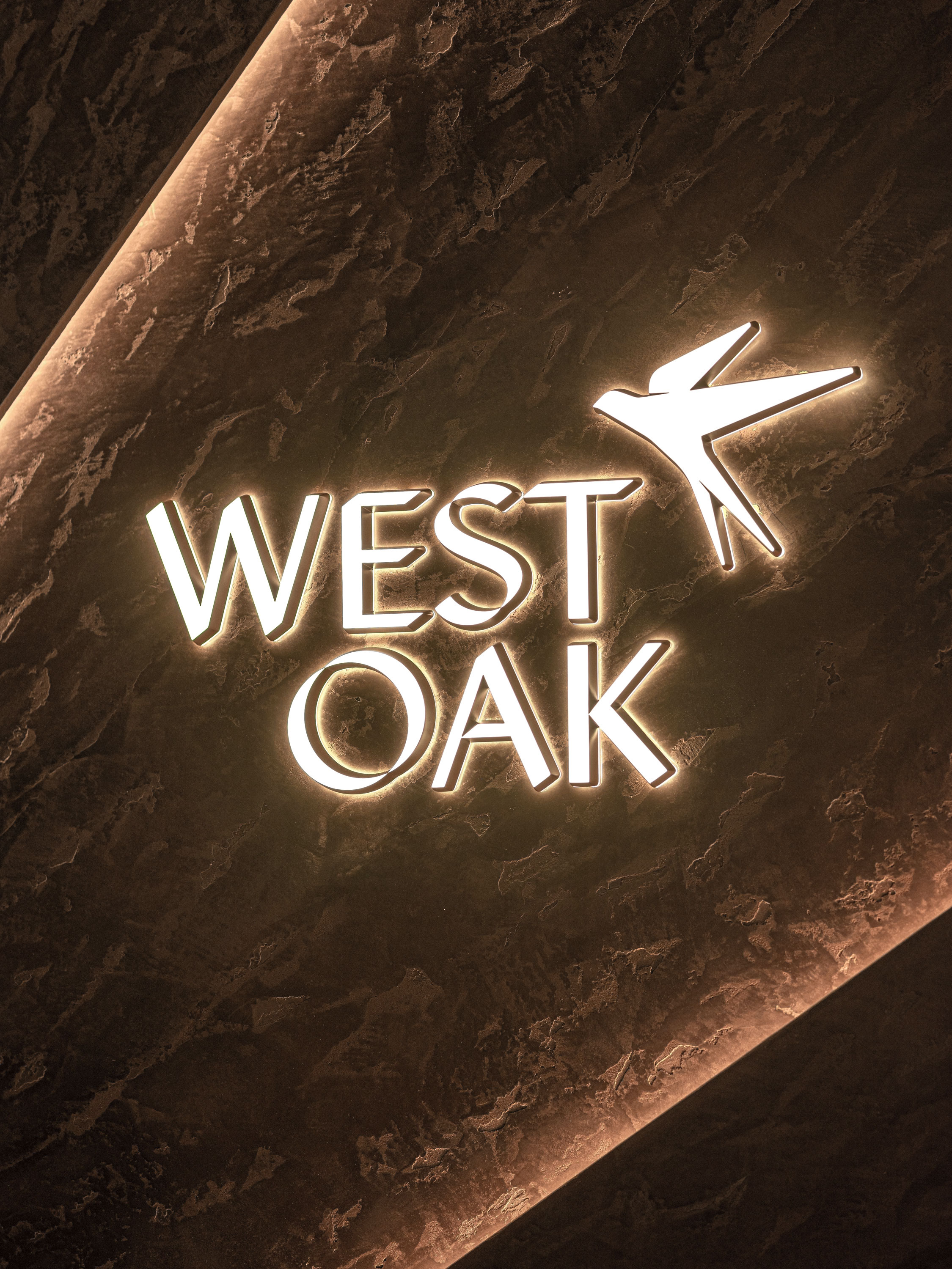
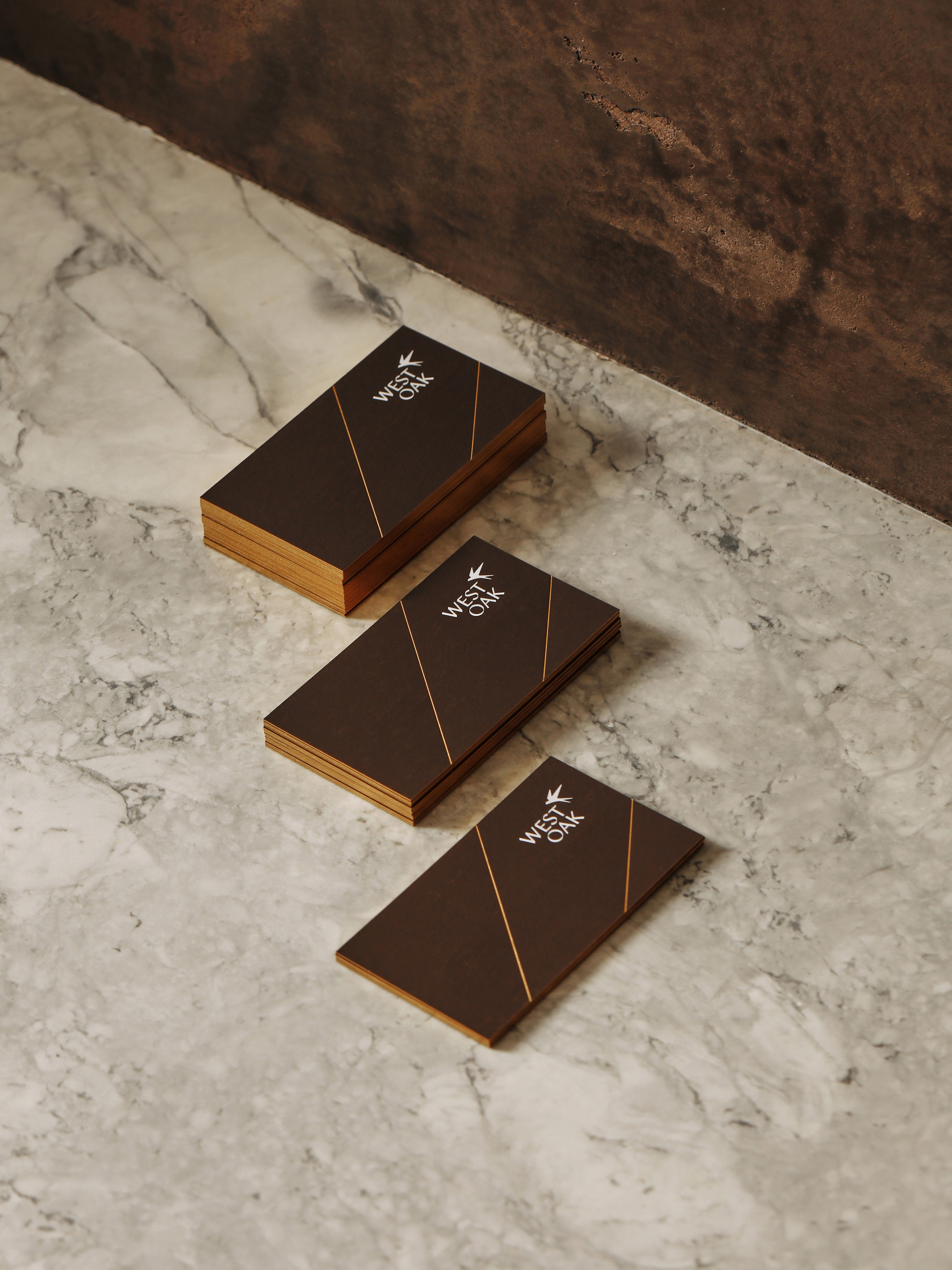
West Oak
West Side Prestige.
Oakridge Convenience.
Year
2020
Discipline
Residential Real Estate
Services
Brand Identity
Name Generation
Art/Creative Direction
Commercial Photography
Editorial
Packaging
Environmental Design
Signage & Wayfinding
Integrated Campaigns
Production Management
UI/UX
Website Design & Development
Collaborators
Photography by Shawn Image
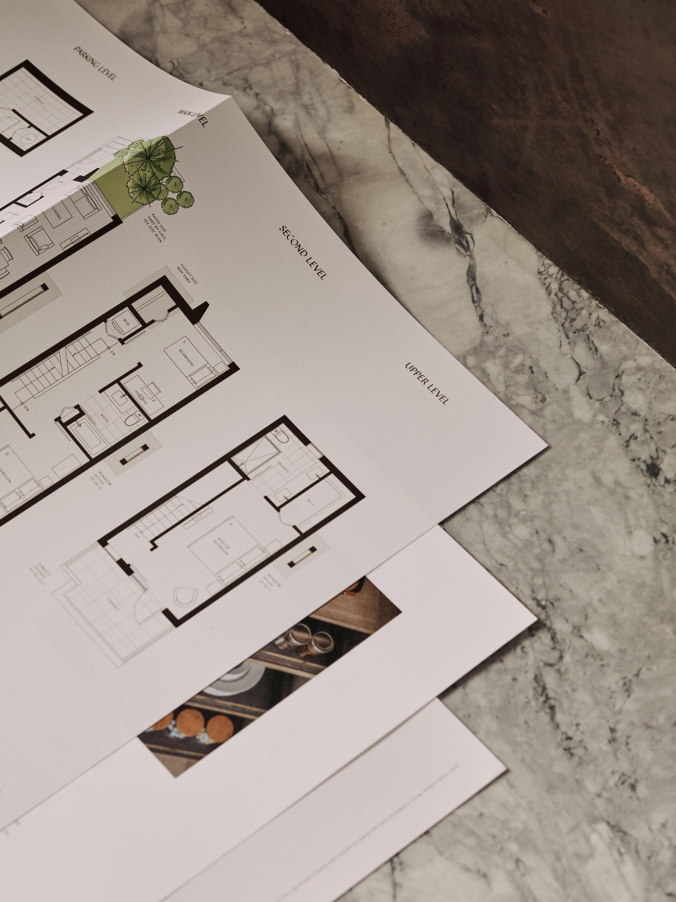
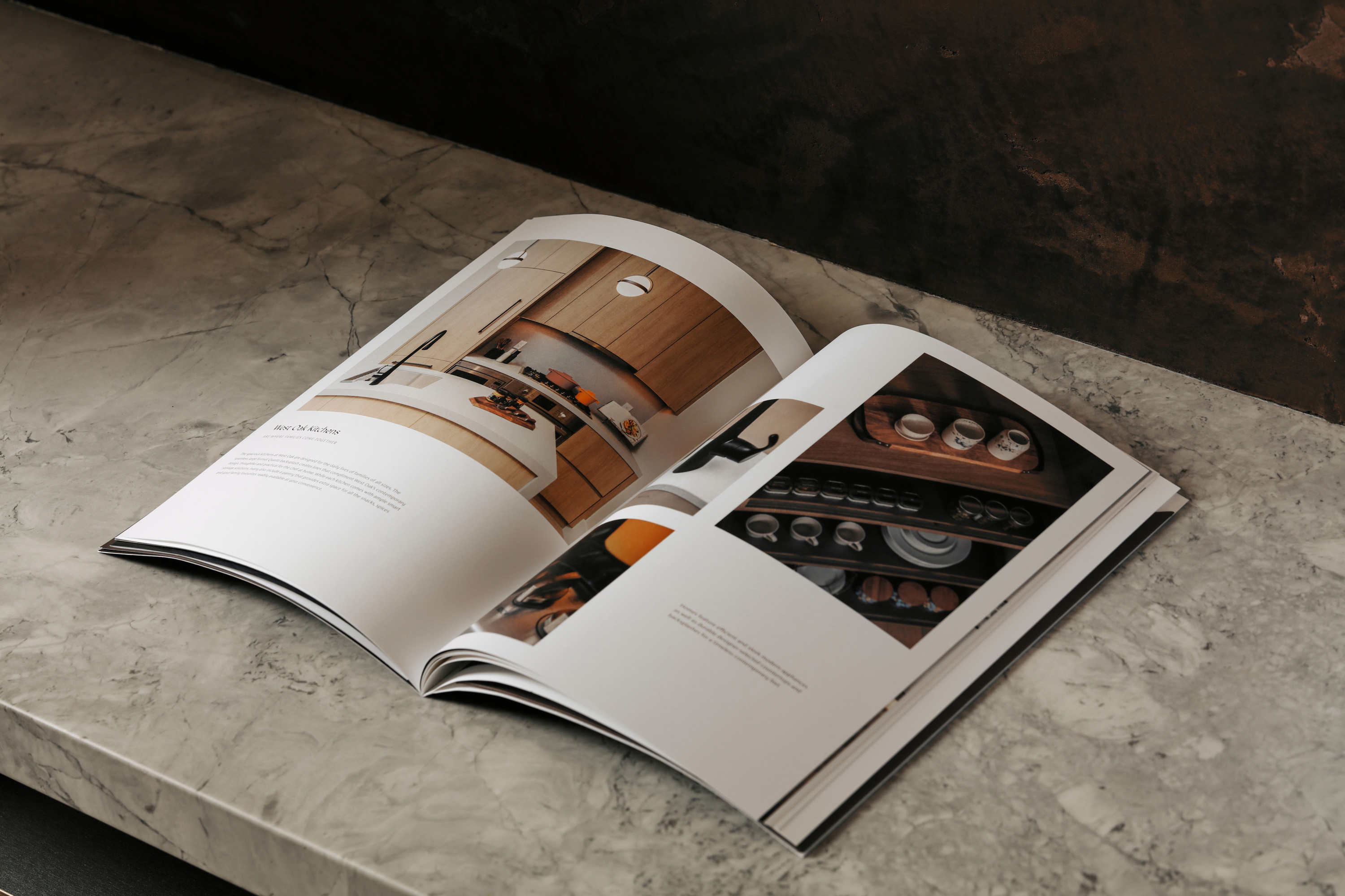
West Oak pairs the prestige of West Side Vancouver living with the convenience of a central location at Oak Street and 49th Avenue, close to outstanding schools, parks, shopping, restaurants, and the reinvigorated Oakridge Centre hub. West Oak is a luxury development by SHOKAI at the heart of a highly sought-after community — and an ideal place to call home.


We were commissioned to craft a luxurious residential brand that seamlessly blends the natural tranquility of West Vancouver with the city’s prestige, convenience, and superiority. To fully realize the brand’s potential, our team offered a suite of custom design services, including brand creation, printing, marketing materials, and presentation centre design. Through our designs, Netmate Studio successfully integrated Vancouver’s ever-evolving urban lifestyle with the lush green natural environment beloved by its inhabitants.
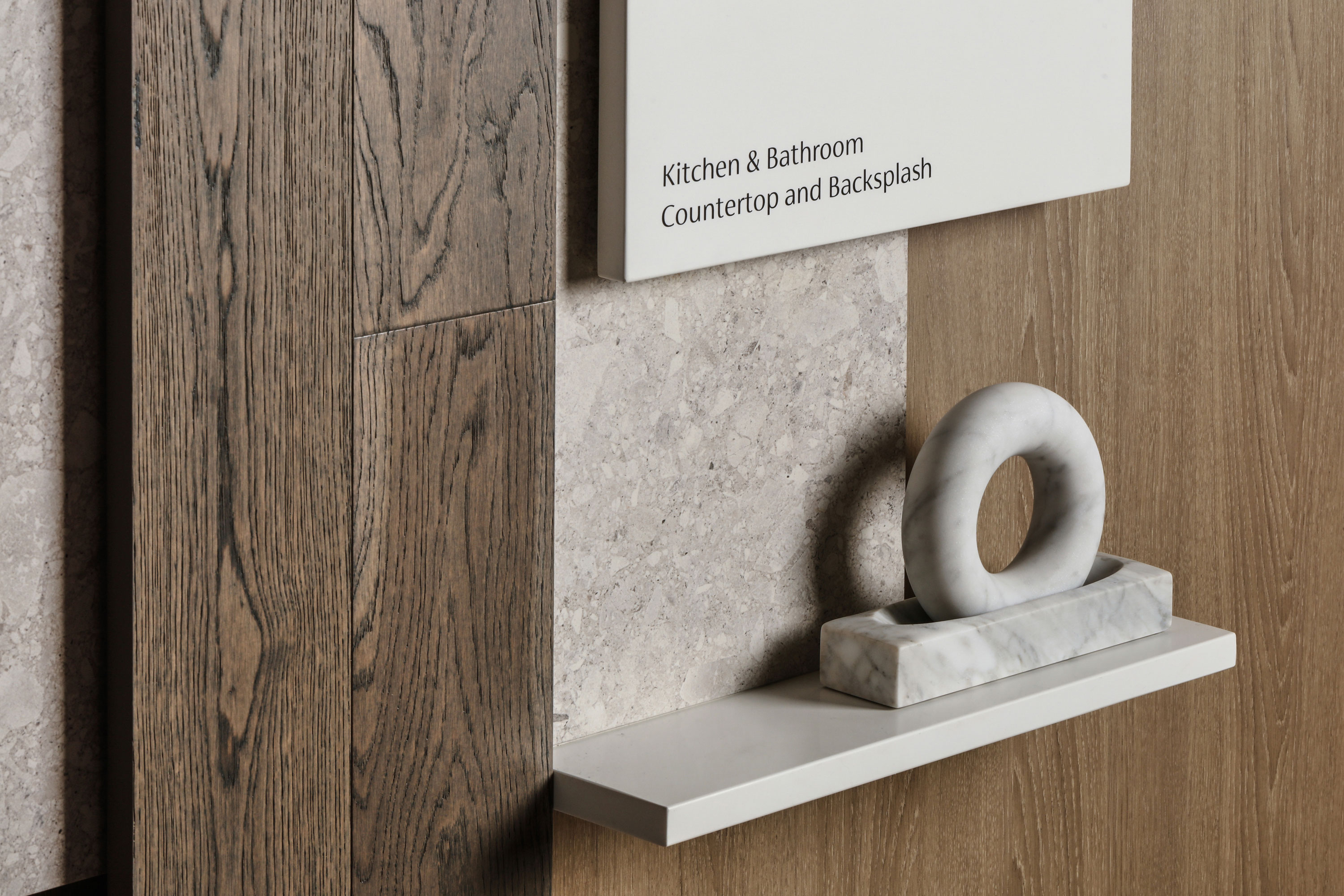
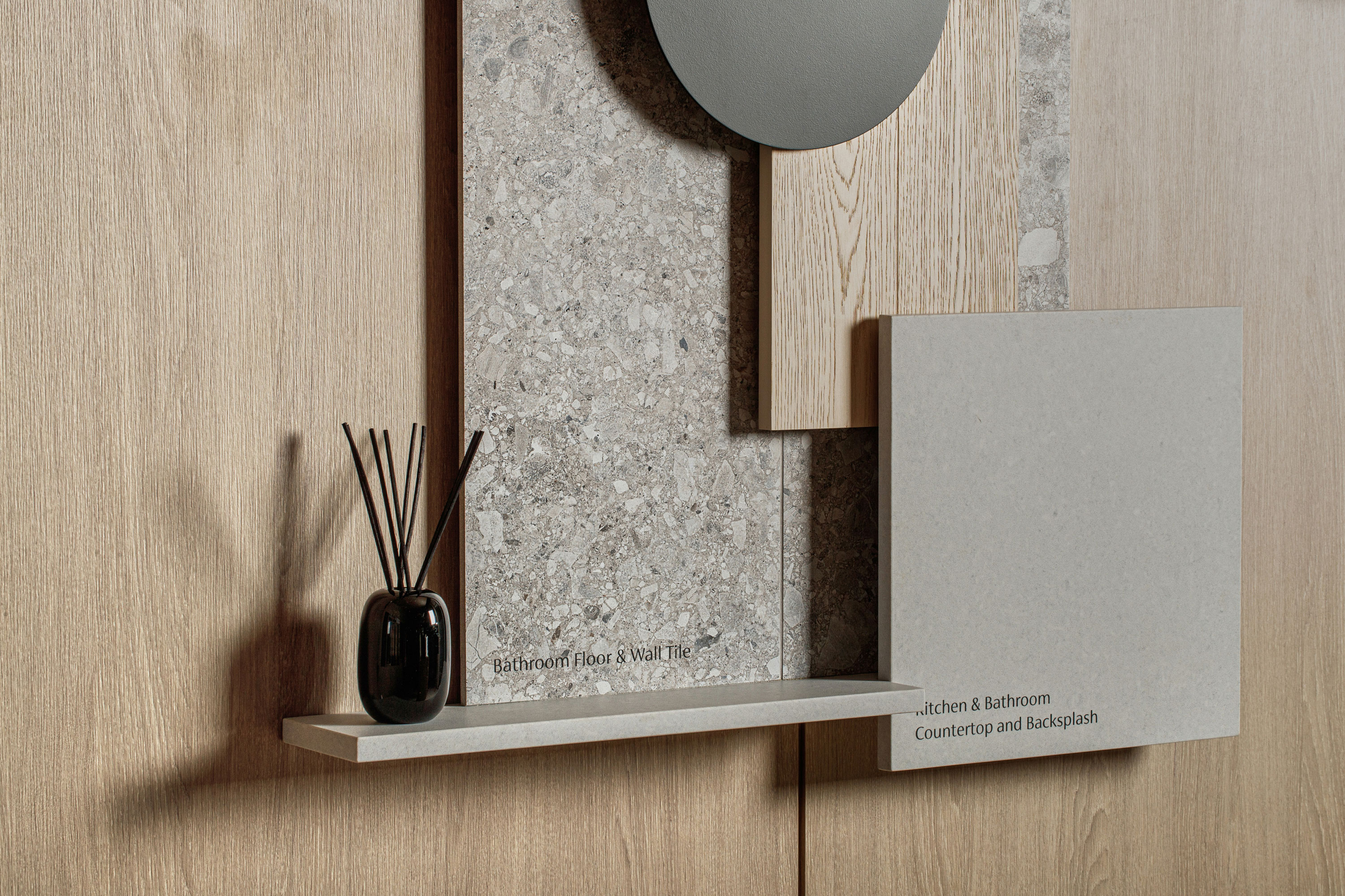
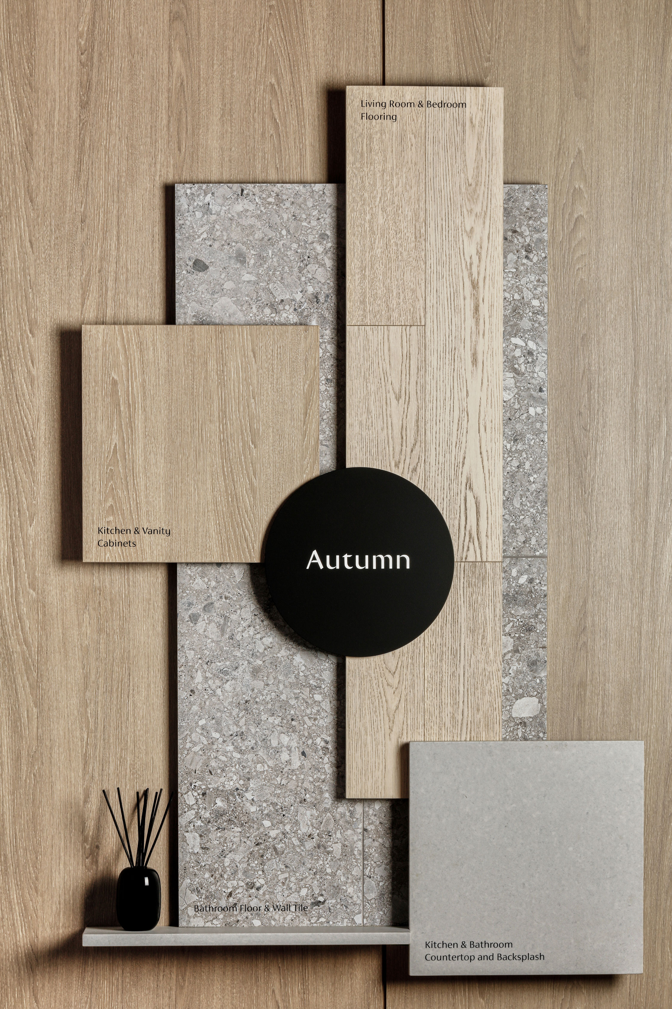
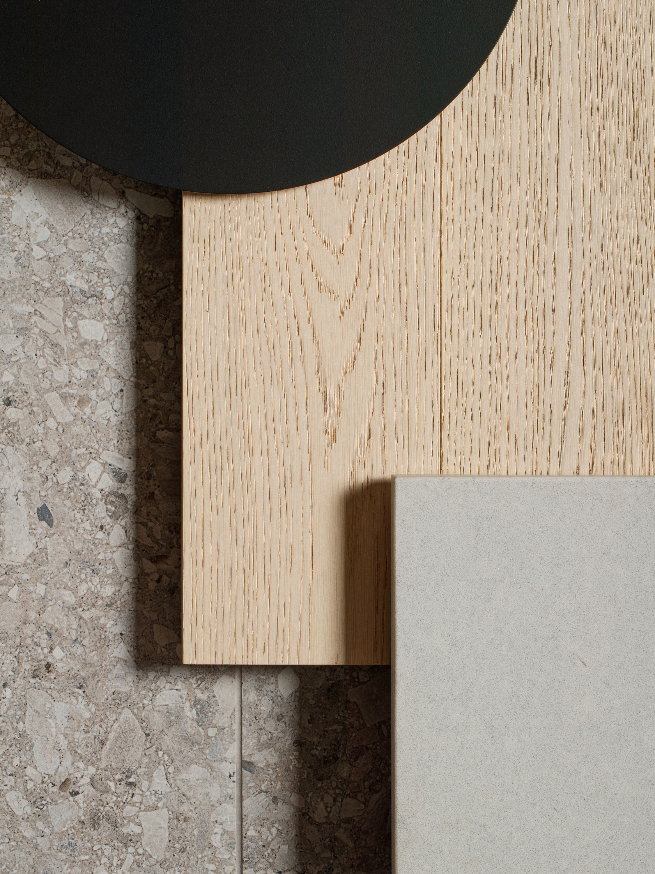
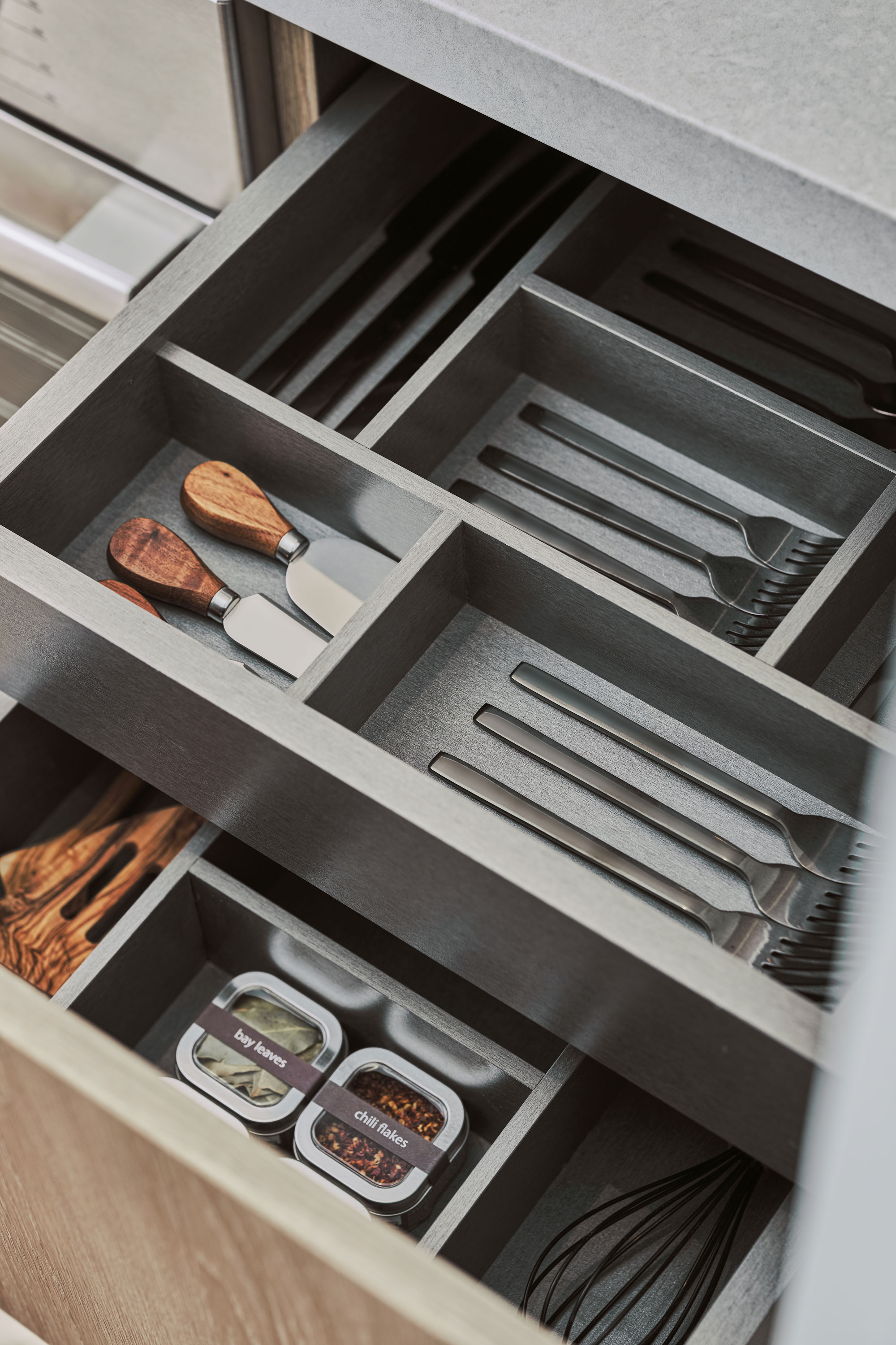
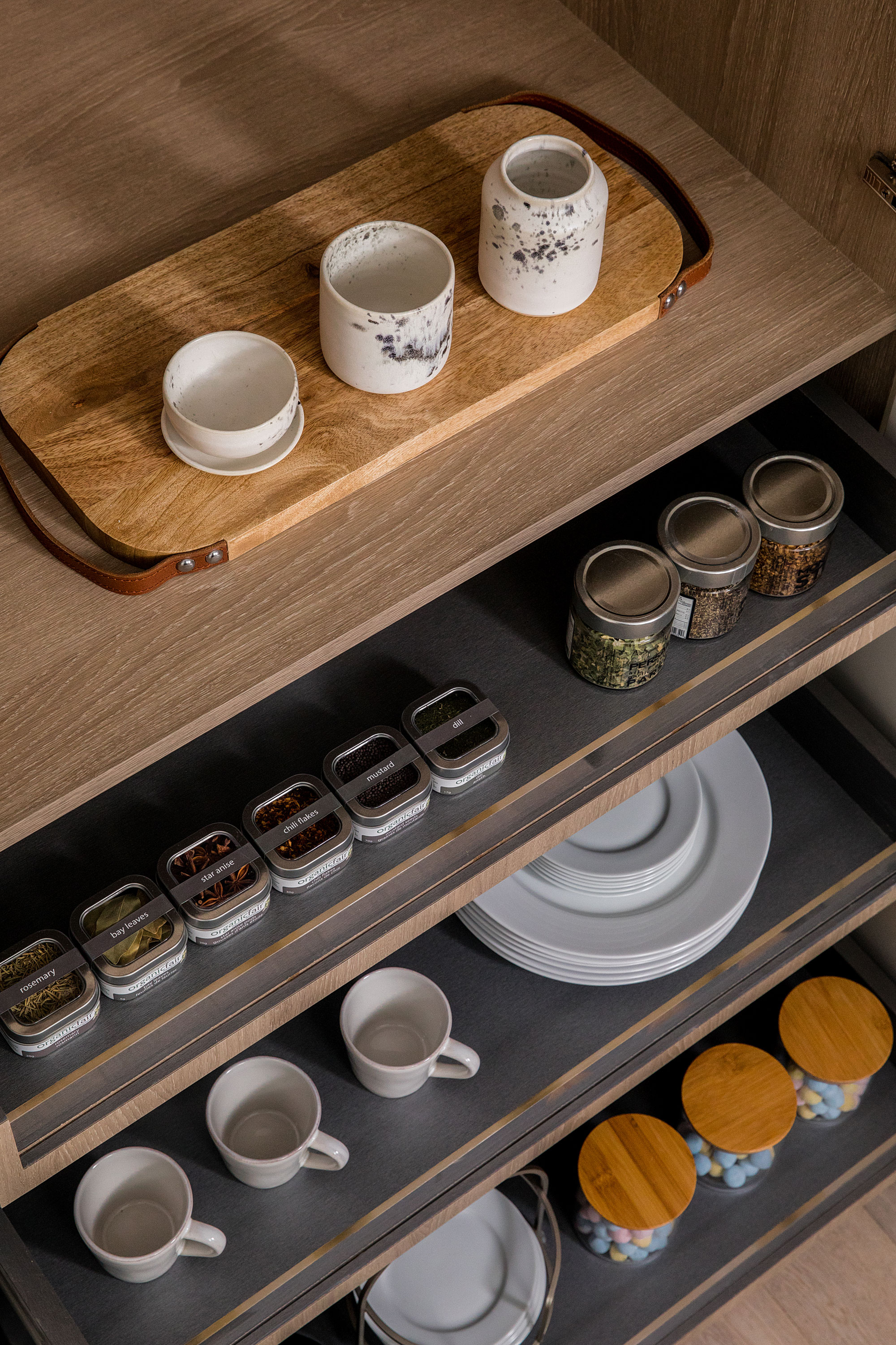
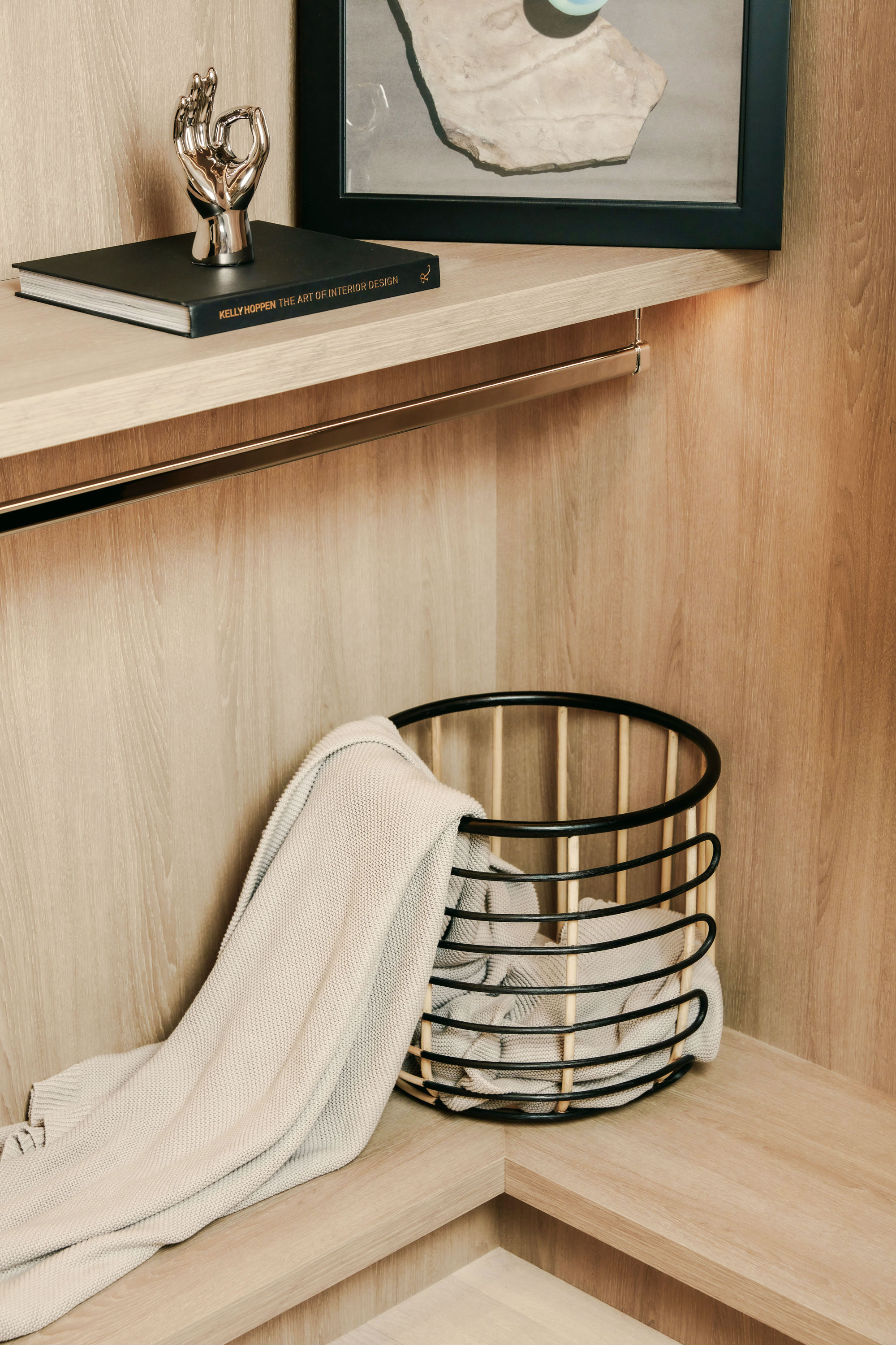
In close collaboration with well-known local vendors, we brought a series of aesthetically pleasing and creative design concepts to life. Among these, the most eye-catching and well-received was the material display board design in the presentation centre. We embraced a challenging design approach after departing from the conventional rectangular tile display. Various building materials were cut into specific geometric shapes, then meticulously assembled, layered and staggered to create an innovative visual effect that left a lasting impression.
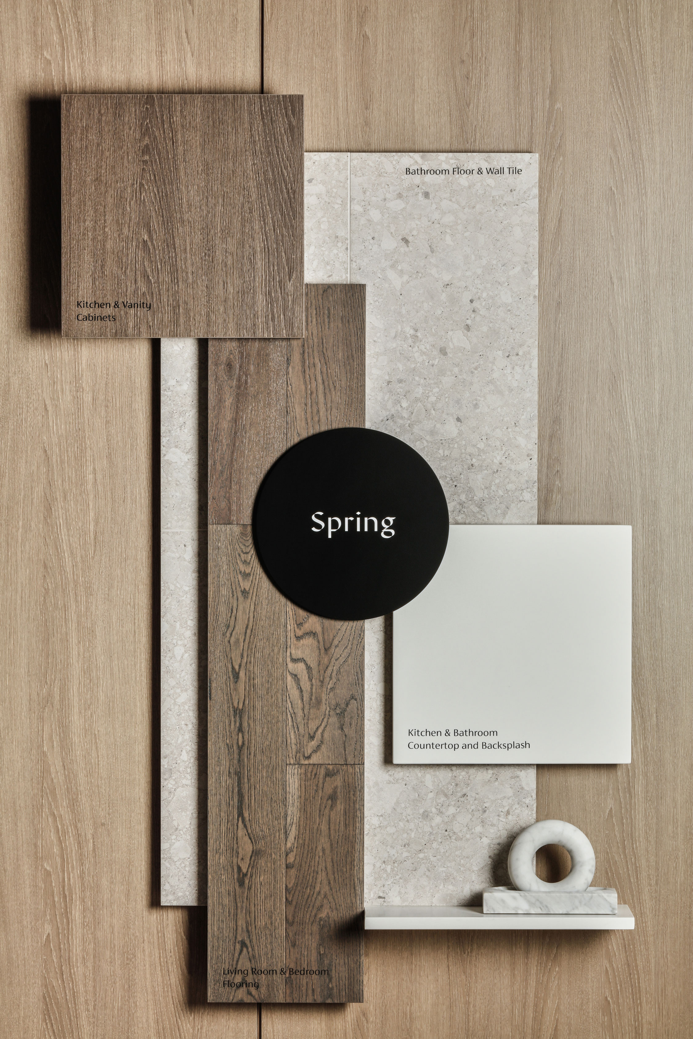


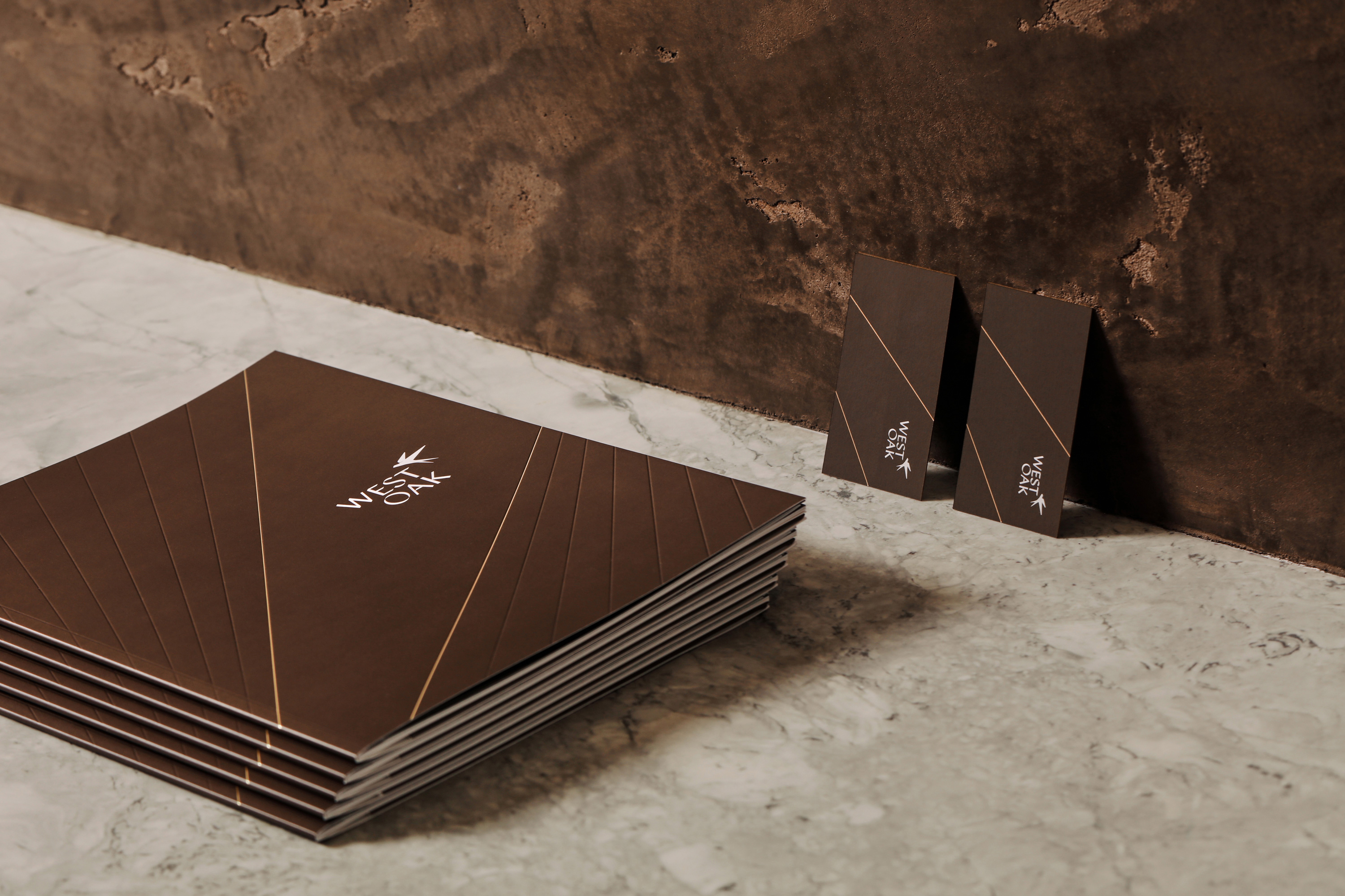
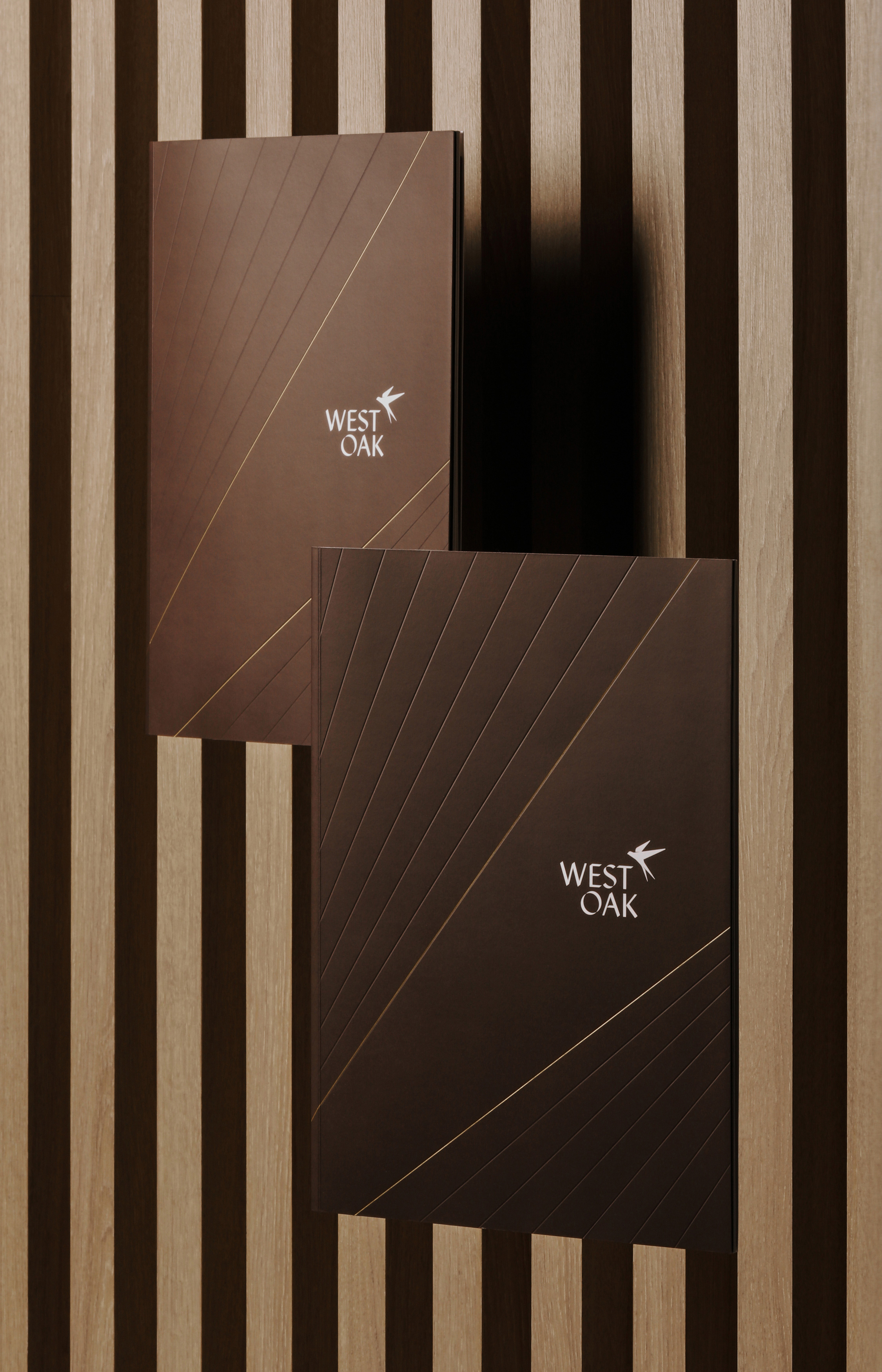
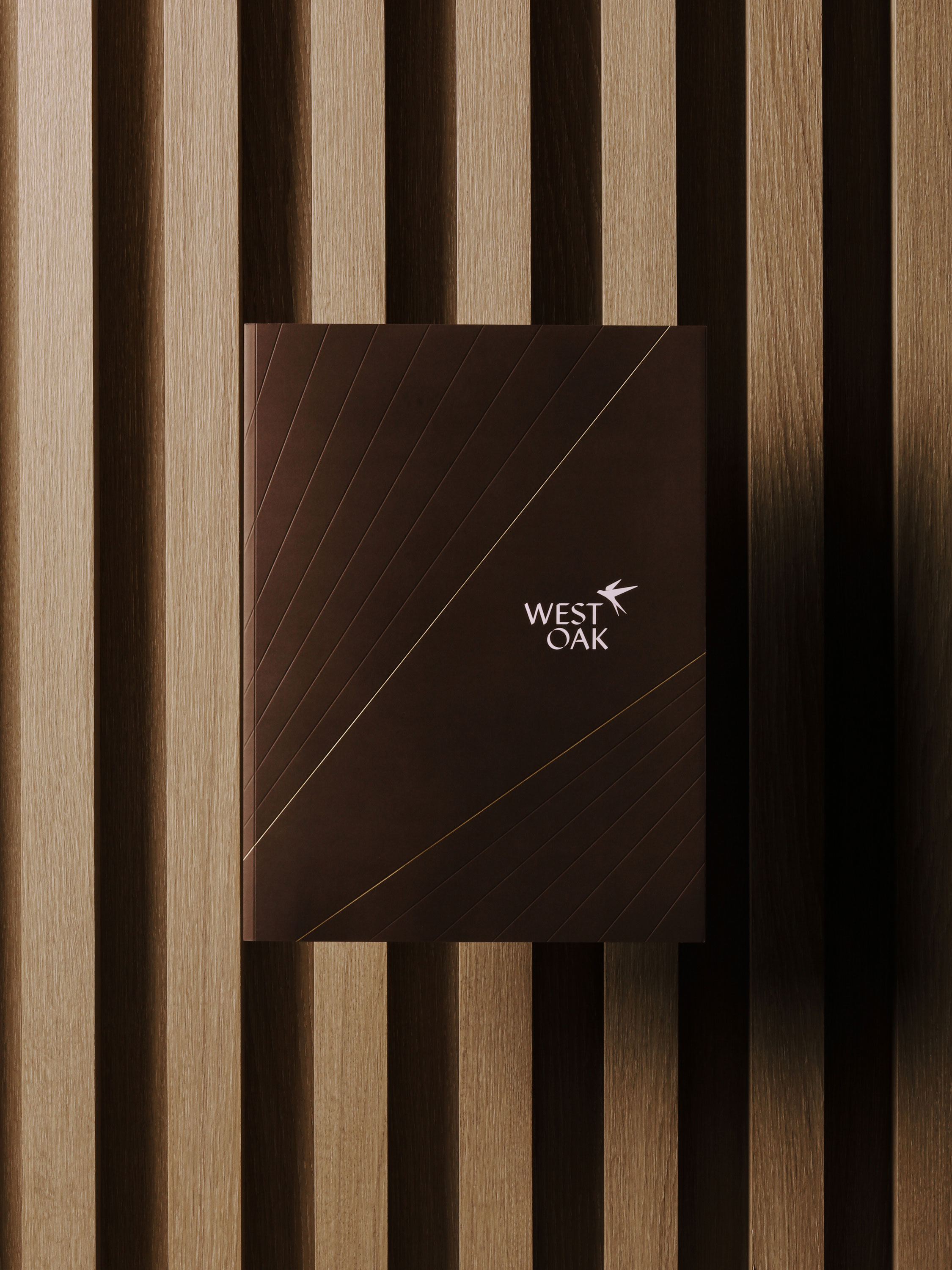
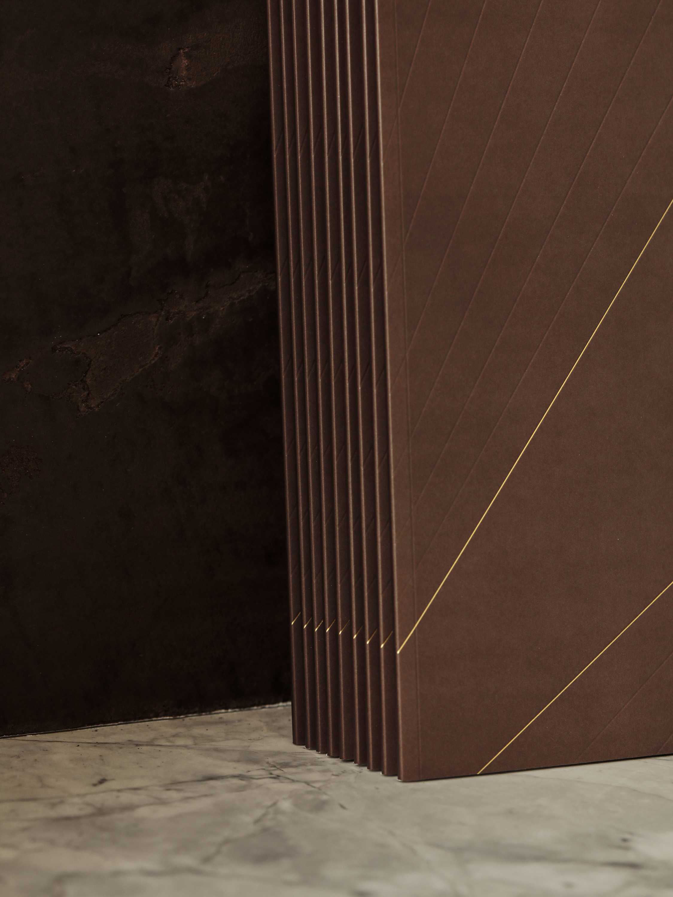
In Chinese culture, the swallow is a symbol of prosperity and wealth. We take inspiration from this agile and endearing creature’s lifestyle to metaphorically depict the balance people strike between nature and urban life. The colour palette draws on earthy brown hues, uniquely highlighting the project’s composed demeanour, elegant style, and timeless appeal. The font selection aims to bring out the brand’s contemporary character. The primary font encapsulates the sense of nature and organic quality, while the secondary font enhances the urban atmosphere through a modern and minimalistic aesthetic.


This project represents the perfect fusion of Eastern traditional culture and Western modern aesthetics. Netmate consistently upholds the pursuit of excellence in creativity, striving for perfection in every detail to ensure the most flawless success.